Being visually identifiable was were brand all began, and it continues to be important today. A visual identity isn’t simply a logo, it is a coherent visual language which conveys key messages about the brand to people.
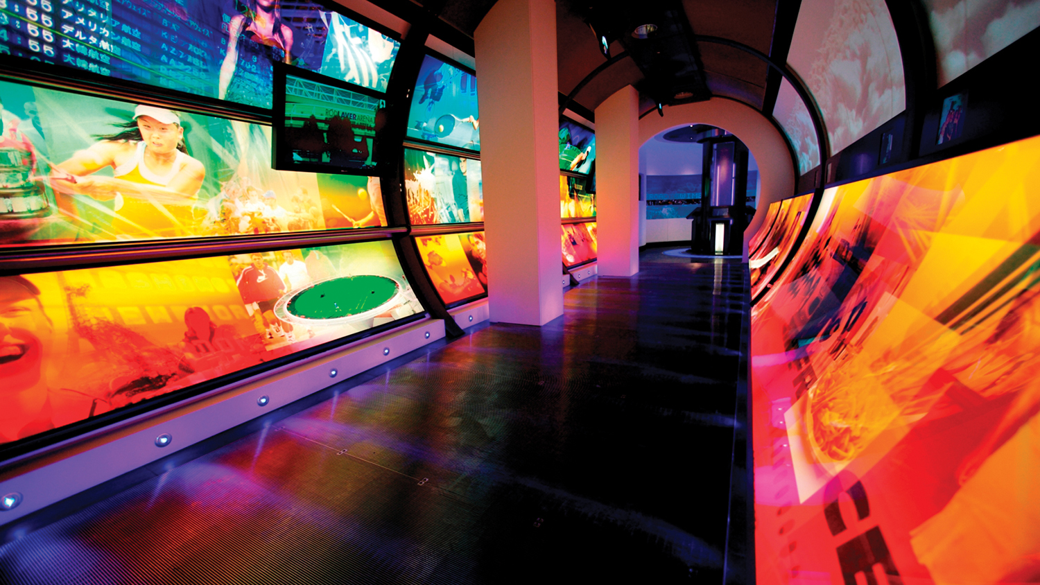
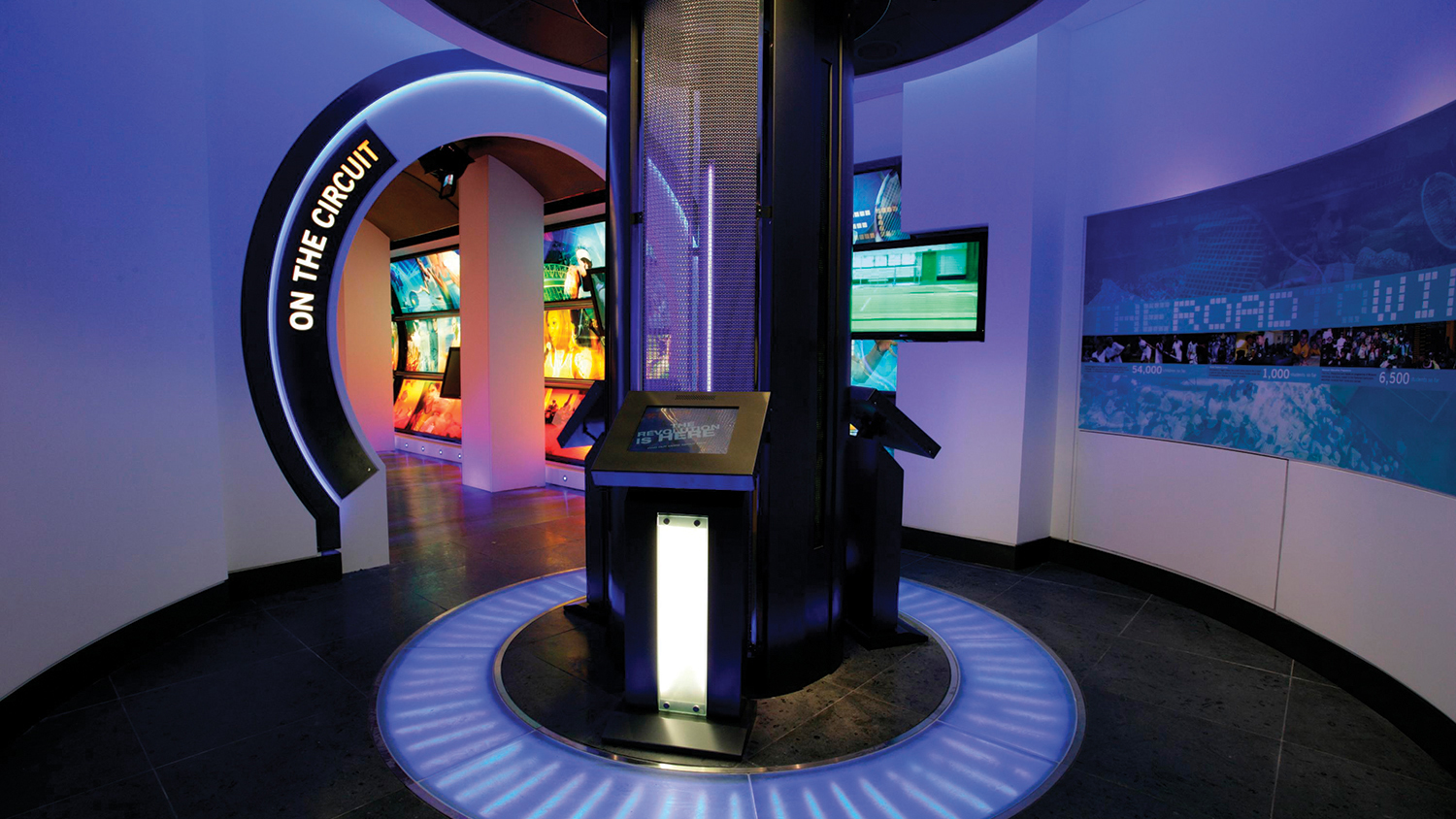
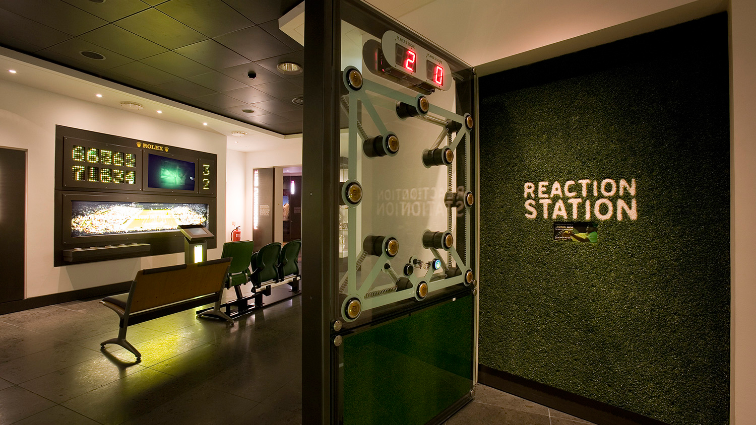
Working with a leading sports venue, we partnered with specialist designers to create a visual identity which would reflect two strands of the brand – the venue’s heritage and the dynamism of the game of tennis itself.
The visual environment led on emotive words which related to what was important right now in the game and the place itself. The lead imagery style sat on a white background, which was a visual reference to one of the traditions the organisation is famous for. The overall aim of the visual identity was to communicate the organisation as being forward-thinking, vibrant and colourful whilst reflecting the energy of the sport they are so famous for.
Over the years the visual identity has continued to evolve and reflect the brand in different ways. However, it always seeks to identify the core aspects of the brand whilst being appealing to people. The ‘stand out’ approach of the visual identity has played a part in driving visitor numbers up year on year since 2006.
(Work was undertaken at 1977 Design)
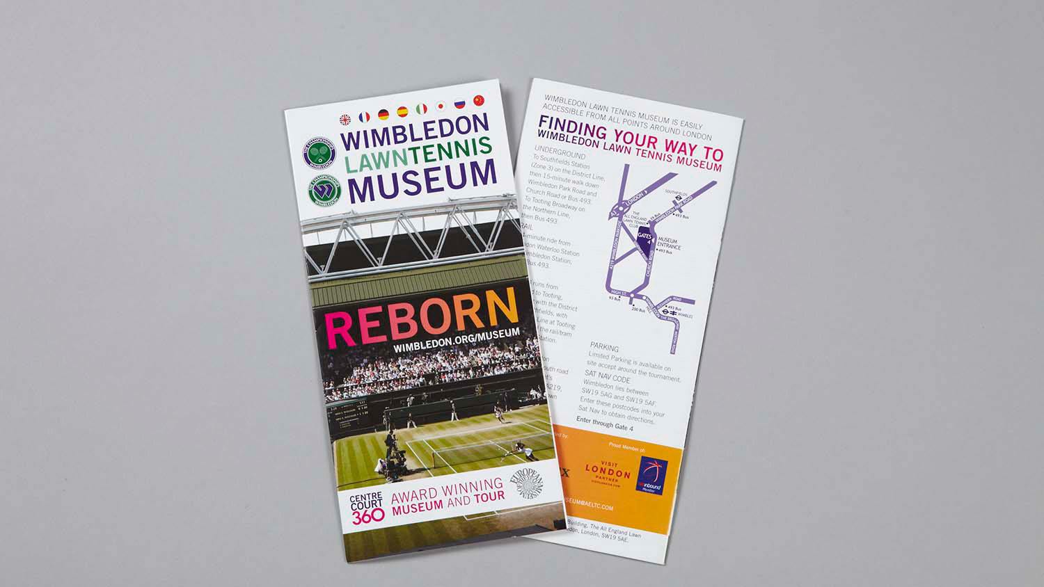
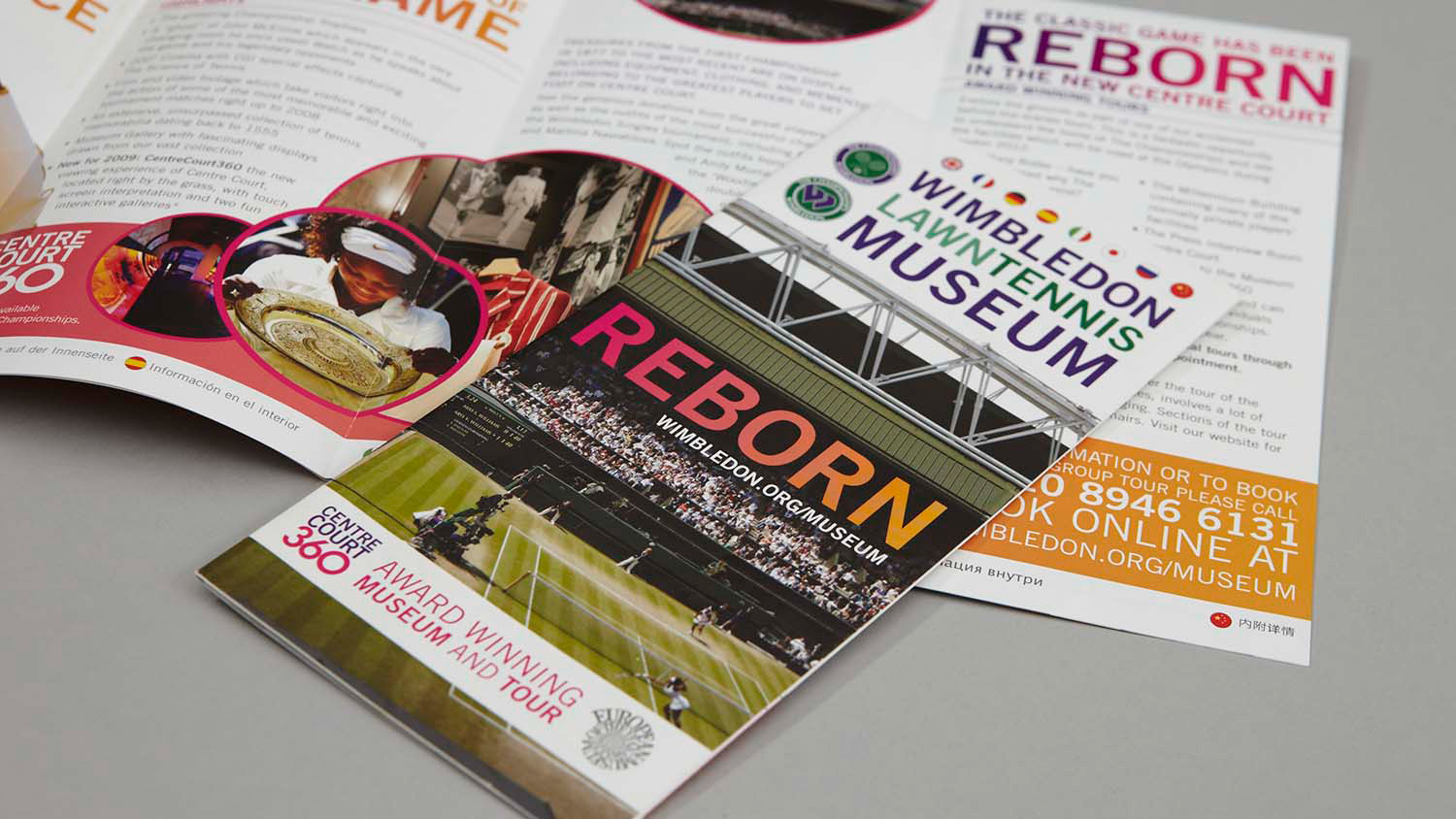
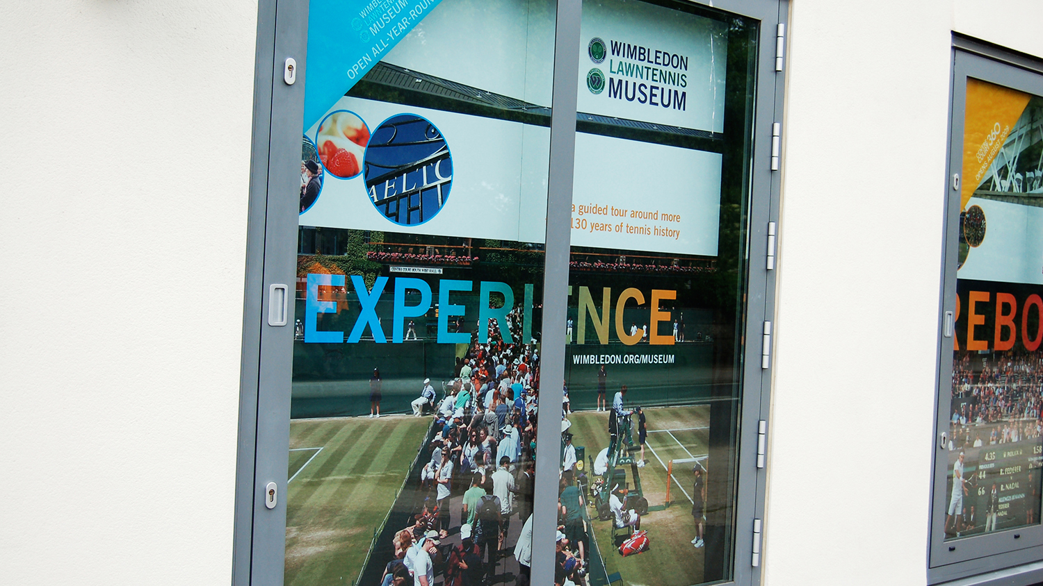
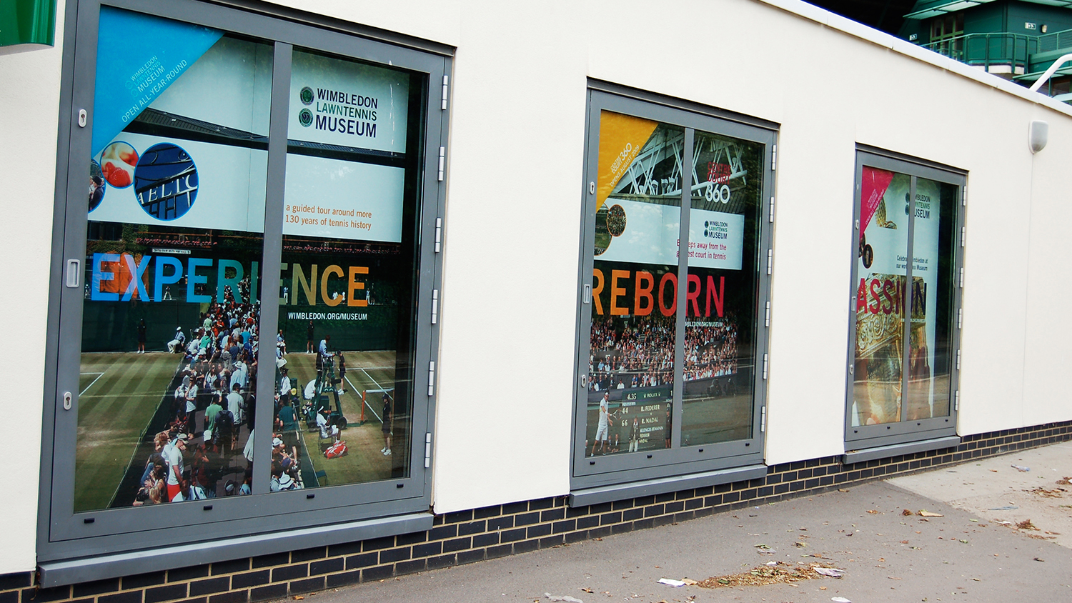
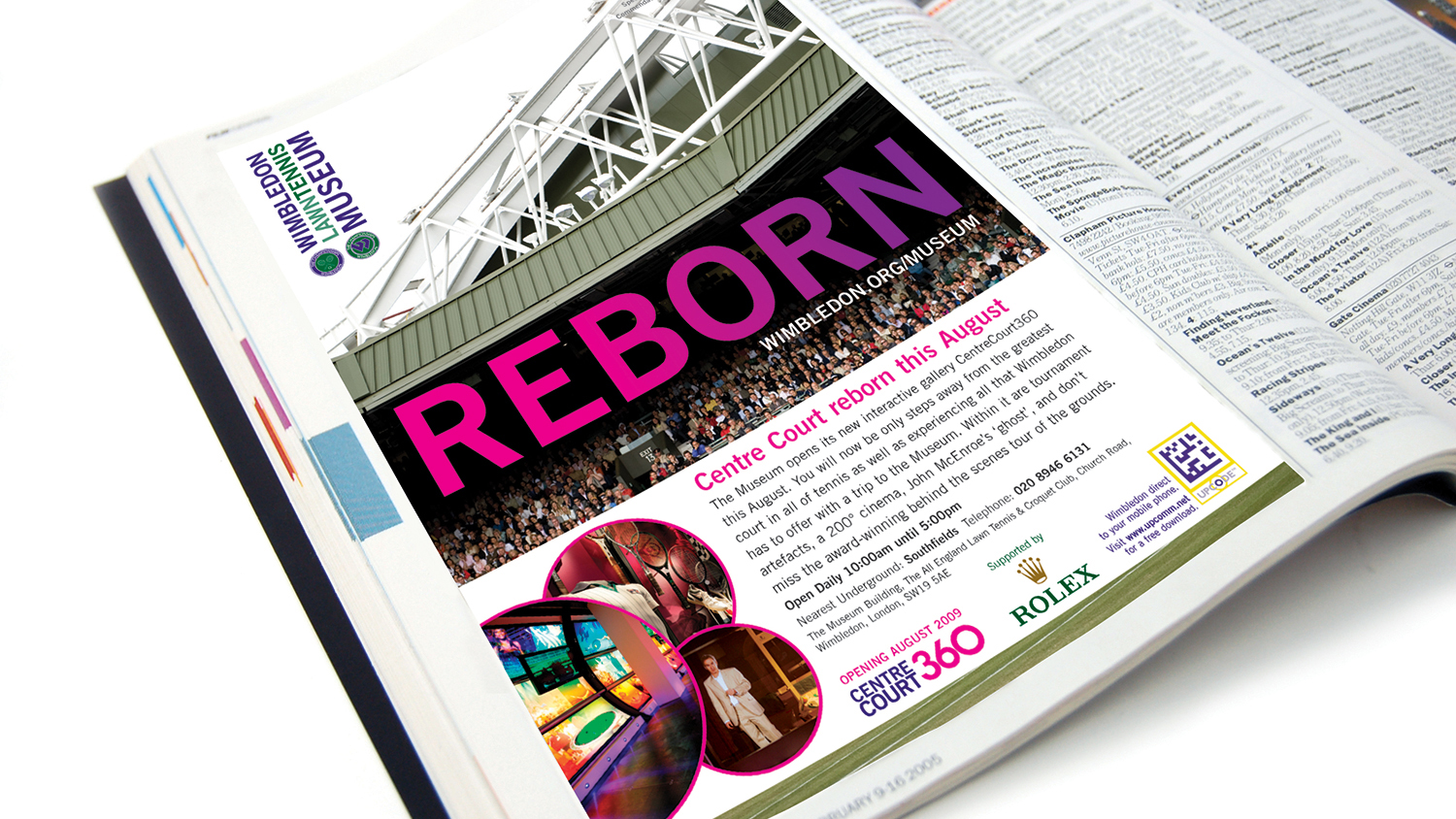
Wimbledon Lawn Tennis Museum is the largest tennis museum in the world.
To talk more about how to develop an identifiable visual identity please get in touch.
Keep people interested with a brand in process
Keep brand simple. Talk to us